
Wednesday, October 17, 2012
Week 11-14 //
We spent these weeks discussing the different areas for our last project: branding, propaganda and information graphics, and working on our sketch note or infographic.

Friday, October 12, 2012
Week Ten // Infographics Exercise
This week we spent the class doing an exercise which involved creating
infographics with 50 images of a product or object and arranging them into subjects. I did two which were categorized into Style and Colour.


The hand-out we were given was from Madison magazine and was an article about a group of teenagers who broke into a couple of celebrities homes and stole various of their possessions with the aid of the technology and social media.


The hand-out we were given was from Madison magazine and was an article about a group of teenagers who broke into a couple of celebrities homes and stole various of their possessions with the aid of the technology and social media.

This case is now being made into a movie by Sofia Coppola and is set to be released next year.
What stood out to me was the power that people have with social media in today's age and when the power gets into the wrong hands it can go wrong. I also found it really interesting how the leader of the group, Nick Prugo, was the only one to get a Jail sentence. In the article it states that this case demonstrates the level of confusion we have between celebrity and non-celebrity and that the defining line between them and us is blurred. What I think of this statement is that it should be that way. Celebrities are just people like you and me and glorifying them like they are Gods doesn't help anyone. Also, if the people hadn't been stolen from weren't celebrities, would it be that publicized in the media?
What stood out to me was the power that people have with social media in today's age and when the power gets into the wrong hands it can go wrong. I also found it really interesting how the leader of the group, Nick Prugo, was the only one to get a Jail sentence. In the article it states that this case demonstrates the level of confusion we have between celebrity and non-celebrity and that the defining line between them and us is blurred. What I think of this statement is that it should be that way. Celebrities are just people like you and me and glorifying them like they are Gods doesn't help anyone. Also, if the people hadn't been stolen from weren't celebrities, would it be that publicized in the media?
Friday, October 5, 2012
Week 9 //
This week we started the new brief by looking at the three different areas of design: Propaganda, Branding and Information Graphics. We compared their methodologies.
Brand Promotion //
purpose/function
- To get people to engage with or buy their product, to increase
demand, to promote information, to differentiate the product, to build
brand equity, to stabilize sales and to offset competitors marketing
efforts.
style and medium - print, web, TV, radio, outdoor advertising, direct marketing, experiential marketing, style depends on the brand, consistent throughout different medias.
Propaganda //
purpose/function - To convince selling an alternative view or a call to actionmotivation - To promote political/social agendas decreasing resistance and gaining attention to encourage participation via motivation rather than force.
style and medium - Varies depending on era. From print to online to TV. Powerful exaggerations of reality, deceptive to the truth, delivered as a movement.
effectiveness - Generally very effective, people respond to powerful imagery, creates peer pressure to conform, usually from trusted sources.
dissemination - Viral social media, inciting movements of the mass. In the past, word of mouth, posters and TV commercials.
Information Design //
purpose/function - present complex information in an easily digested form. Sometimes an instant comprehension. Helps to see patterns in data so assists in using research effectively.
motivation - transmit knowledge and difficult information that would be hard to understand as a regular document. The need to analyse gathered information and deduce meaning.
style and medium - print and online, visually attractive, extremely tight design, often with symbols and arranged as a metaphor often with images and illustrations.
effectiveness - a much better way to transmit information like annual revenues, scientific data and the results of research
dissemination - Annual Reports, websites, magazines about scientific research
Thursday, September 27, 2012
Week 7 //
The first group of people presented their findings of the report on Magazines and culture.
Tuesday, September 18, 2012
Tuesday, September 11, 2012
Week Five // Influential Designers in Magazine History.
Magazines have an important role in society, which is driving and reflecting culture.
Designers learn from
past trends and are influenced by history.
Designers should be thinking about the following:
1. The motivating
and underlying principals of the magazine and the article - what is the message that they are trying to send.
2.
The
reasons why a particular design works
in a specific context (in any given period)
in a specific context (in any given period)
3.
How the
past plays a part in mapping out future trends and directions.


Neville Brody's magazines (Arena, The Face) appropriated Russian constructivism. Neville implemented his views into the magazine but he communicated them in a subtle way because he didn’t want to over throw the government. He thought there was something going on that needed to be changed.
"The Face" was a magazine that was published in the UK in the 1980's. It's focus was British music, fashion and culture. It had a cool outsider status.


From deconstructing the layout we can see that Brody designed the layout
to speak to young people.
Some of the characteristic of his layouts were sans serif fonts, block type, using rules and scale.
His layouts worked because he
referenced a particular style.

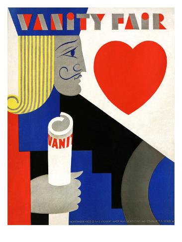
Mehemed Fehmy Agha was an influential art director in 1900's. He helped to define the role of a magazine art director. He loved to experiment and was able to do so in the pages of Vogue, Vanity Fair and House & Garden.



What he brought to
America editorial design was a fresh outlook. Montage, duotone, full colour
photos. He favoured photographs over illustrations. He used images that went
over the double page spread.
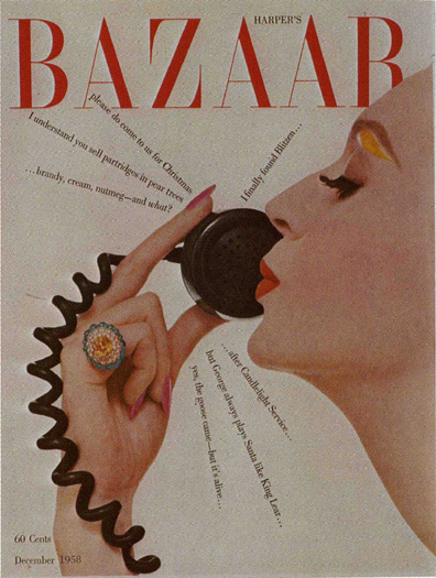
Alexey Brodovich was another influential art director. He was a Russian immigrant and became art director of Harper's Bazaar. He was a strong leader in his field which helped him to develop the edge design he is known for today.


Characteristics of his design style:
- Taking the
images over the double pages
- Single columns of type
- Integrating
image and type
- Asymmetrical
layouts
- Lots of
white space
- He loved
diagonals which created movement in his layouts.
- Elegance,
restrained typography, photography invested in lively drama
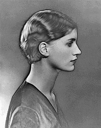
Man Rey was an Avant Garde photographer at the time and was friends with Alexey Brodovitch. Alexey would ask Man Rey to photograph for Harper's.


Willy Fleckhaus
Willy Fleckhaus was one of the most innovative and influential designers of the postwar era. His design was characterized by swiss formanism, grids
and simple typography, cropping, massive close ups, surreal portraits and distinctive black pages.

In 1959, Willy was aquinted with the magazine Twen, short for twenty. It catered to the first generation of young
German adults who came of age after the end of World War II. It was
published from 1959-1970 when deepening political and intellectual
thought, combined with increasing sexual awareness, captured the
attention of its spirited audience. Twen was unmatched in its avant-garde visuals, layouts, typography and fine, literary content.


Anachronistic
1.The
representation of someone as existing or something as happening in other than
chronological, proper, or historical order.
2. One that is
out of its proper or chronological order, especially a person or practice that
belongs to an earlier time: "A new age had plainly dawned, an age that
made the institution of a segregated picnic seem an anachronism" (Henry
Louis Gates, Jr.)
____________________________________________________
David Carson is considered by many to be one of the world’s most
influential graphic designers. He describes himself as a “hands-on”
designer and has a unique, intuition-driven way of creating everything
from magazines to TV commercials.
He has an intuitive ability
to combine type and image as an expression.
Before he came into the world of Graphic Design he was a professional surfer and no. 4 in the world.


For this article, David Carson thought the article was boring and dull so he made the font Dingbats.


While the contents of its pages were not related to graphic design, Ray
Gun magazine was founded in 1992 and proved to be an exploration of typography, layout and
visual storytelling that would shift the approach of many graphic
designers. The magazine appealed to 'ultra cool' people.

Terry Jones,
born in 1945 in Northampton, England, is the Editor-In-Chief, Creative
Director and Publisher of i-D. For more than 30 years Terry has established
himself as one of the most experimental creative directors of his
generation, from the covers of Vanity Fair and Vogue,
where he was art director from 1972-77, to the innovative designs of i-D
magazine, which he founded in 1980. The first issue of i-D was created
at his home studio and published in the form of a hand-stapled fanzine
with text produced on an IBM golfball typewriter.
![Lily Cole - i-D Magazine [United Kingdom] (September 2008)](https://lh3.googleusercontent.com/blogger_img_proxy/AEn0k_ucPIL5YVIghSJ3M6fiiuFOiXdButpTs9ed-P9Wxt_AGUhSp8V0kyx0PFxLVghxDTOogJ_idvNFBVej6FoJb36EOtuxpaWebXijJdfvLow6SK1jOIjFqalGo9l1O-kN11U=s0-d)


Terry Jones is one of the most influential designers today. His mainstream experience included Donna, British vogue
magazine and American vogue magazine. But when he started working on the youth title 'I-D' Magazine, he showed his real strengths and individuality. 'I-D' was born out of the punk movement and influenced by Dadaism. It had an "anti-celebrity" stance. When designing for I-D, Terry uses design
elements to create a sense of immediacy and spontaneity and used printing techniques before and
after. e.g. Photocopying, moiré

Henry Wolf,
the graphic designer and photographer who was the art director of Esquire,
Harper's Bazaar and Show magazines in the 1950's and 60's.


Vince Frost is arguably one of Australia’s most recognized and globally celebrated and awarded designers.
-->Clean white pages with radical typography and
photography define his design style. His design studio 'Frost' creates design that intrigues people with exciting design.


Really loved this weeks lecture as I love magazines & editorial design. Looking at these examples today, I have come to realize the importance of thinking about the message you are trying to send through your art direction. By message, I don't just mean through the article but how does it affect the message of the overall product. Looking at these designers, it's very inspiring to see how they have left such a big mark and influence on designers after their period of time art directing.These are people who inspire me and my design. People who don't conform to what is going on but challenge and go somewhere completely different. That's what I hope to be as a designer.
Subscribe to:
Posts (Atom)